 Rishabh
 Statistics, at its heart, is about understanding data. But raw numbers, no matter how meticulously collected, often don’t tell the full story. This is where the power of graphs and plots comes in. Visualizing data isn’t just about making things look pretty; it’s about revealing patterns, trends, outliers, and relationships that would otherwise remain hidden in a sea of figures.
In this blog post, we’ll embark on a journey through the fascinating world of statistical graphs and plots. We’ll explore why they are indispensable, delve into some of the most common types, and understand when and how to use them effectively to extract meaningful insights.
Why Visualizing Data is Crucial
Imagine trying to understand the economic health of a nation by just looking at a massive spreadsheet of GDP figures, inflation rates, and employment numbers. It would be an overwhelming task! Now, picture those same figures presented in a clear, concise graph showing trends over time. Suddenly, the narrative becomes clear.
Here’s why graphs and plots are so crucial in statistics:
- Pattern Recognition: Our brains are wired for visual recognition. Graphs make it incredibly easy to spot patterns, trends (increasing, decreasing, cyclical), and clusters that might be invisible in raw data.
- Identifying Outliers: Anomalous data points, or outliers, can significantly skew statistical analysis. Plots like box plots and scatter plots quickly highlight these unusual observations, prompting further investigation.
- Comparing Distributions: When comparing different groups or datasets, visual representations allow for quick and intuitive comparisons of their central tendency, spread, and shape.
- Communicating Insights: Perhaps the most powerful aspect of data visualization is its ability to communicate complex information clearly and effectively to a broad audience, regardless of their statistical background. A well-crafted graph is worth a thousand words (or a thousand data points!).
- Hypothesis Generation: Seeing data visually can spark new questions and hypotheses, guiding further statistical analysis and research.
Common Types of Graphs and Plots
Let’s explore some of the most widely used graphs and plots in statistics, understanding their purpose and best applications.
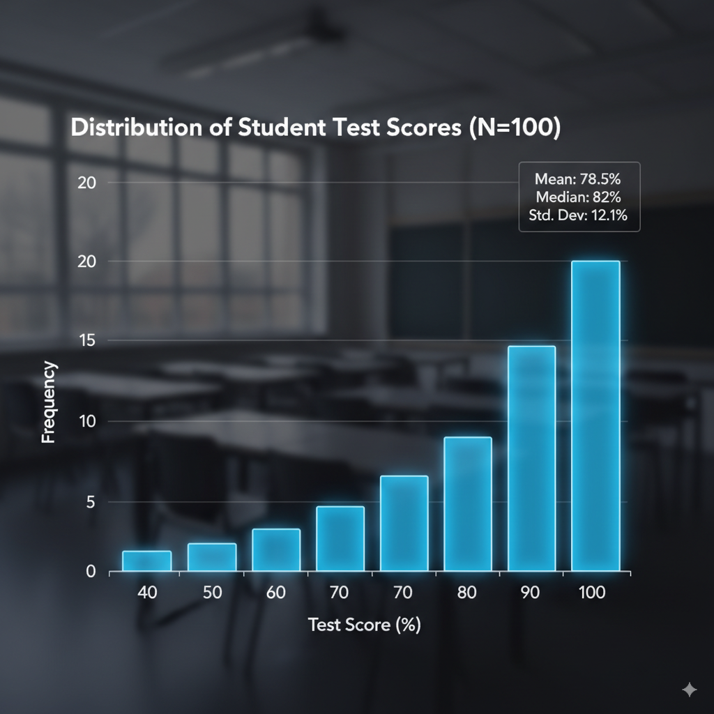
1. Histograms
A histogram is a powerful tool for visualizing the distribution of a single numerical variable. It groups data into “bins” (intervals) and displays the frequency (or relative frequency) of data points falling into each bin using bars.
When to use it: To understand the shape of your data’s distribution (e.g., symmetric, skewed, bimodal), identify its central tendency, and observe its spread.
Example: A histogram showing the distribution of student test scores in a class.
2. Bar Charts
Bar charts are used to compare the frequencies or values of different categories or discrete groups. Each bar represents a category, and its length corresponds to the value it represents.
When to use it: To compare categorical data, show counts for different categories, or compare values across distinct groups.
Example: A bar chart showing the number of different types of fruits sold in a grocery store.

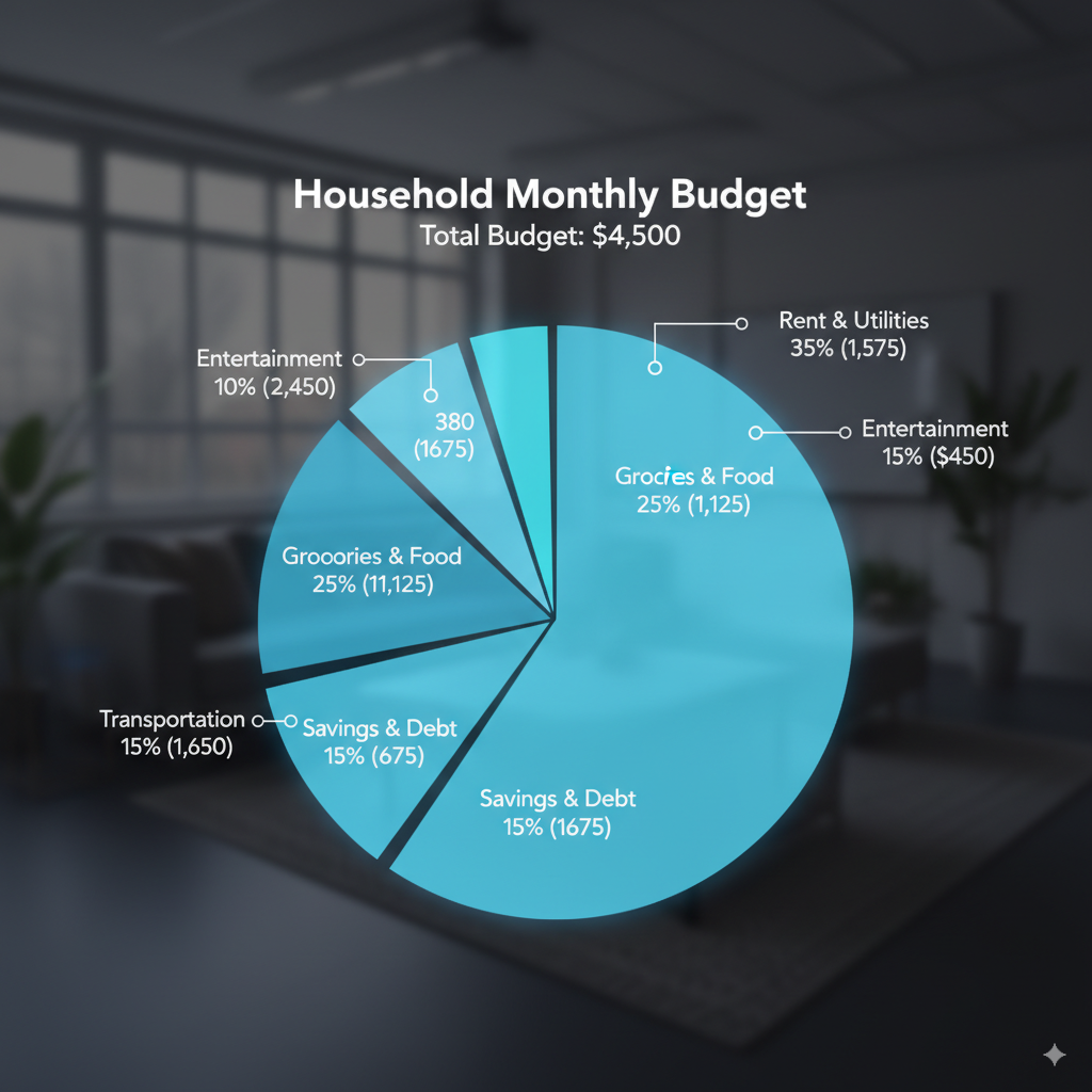
3. Pie Charts
Pie charts represent parts of a whole, where each slice of the “pie” corresponds to a proportion or percentage of the total.
When to use it: To show the composition of a whole. Best used when you have a small number of categories (ideally 2-5) and want to emphasize their relative contributions.
Example: A pie chart illustrating the breakdown of a household budget into different expense categories.
4. Line Graphs
Line graphs are ideal for displaying trends over time or other continuous variables. Data points are plotted and connected by lines, making it easy to see changes and patterns.
When to use it: To show how a variable changes over a continuous interval (e.g., time, temperature). Excellent for identifying trends, seasonality, and cycles.
Example: A line graph tracking the stock price of a company over a year.

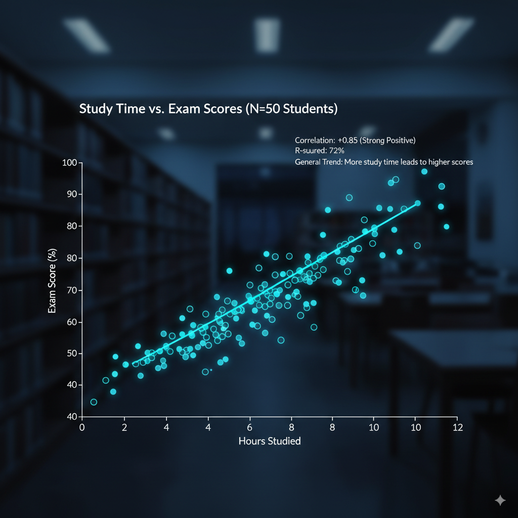
5. Scatter Plots
Scatter plots are used to visualize the relationship between two numerical variables. Each point on the graph represents an observation, with its position determined by its values for the two variables.
When to use it: To identify the presence, direction (positive or negative), and strength of a correlation between two variables, and to spot outliers.
Example: A scatter plot showing the relationship between hours studied and exam scores for a group of students.
Graphs and Plots in Statistics
Graphs and plots are visual representations of data. They help us summarize, explore, and interpret data more effectively than raw numbers or tables.
1. Why Graphs & Plots Are Important?
- Identify patterns, trends, and distributions.
- Spot outliers or unusual observations.
- Compare datasets easily.
- Communicate results effectively to both technical and non-technical audiences.
2. Common Types of Graphs in Statistics
a. Bar Graph
- Used for categorical data.
- Height (or length) of bars represents frequency or proportion.
- Variants: vertical, horizontal, stacked, grouped.
b. Histogram
- Used for continuous (numerical) data.
- Groups data into intervals (bins) and shows frequency.
- Helps visualize distribution (normal, skewed, uniform, etc.).
c. Pie Chart
- Represents data as slices of a circle.
- Best for showing proportions or percentages.
- Not ideal when categories are many or differences are small.
d. Line Graph
- Plots data points connected by lines.
- Often used for time series data (stock prices, weather, sales, etc.).
e. Scatter Plot
- Plots pairs of values (x, y).
- Useful for checking relationships/correlations between variables.
- Trend lines or regression lines can be added.
f. Boxplot (Whisker Plot)
- Summarizes data using median, quartiles, and outliers.
- Great for comparing distributions across groups.
g. Stem-and-Leaf Plot
- Displays data while keeping actual values visible.
- Useful for small datasets.
h. Dot Plot
- Each data point is represented by a dot.
- Effective for small to moderate-sized datasets.
3. Advanced Plots in Statistics
- Heatmaps → show intensity of values with colors.
- Violin Plots → combine boxplot & density plot.
- Density Plots → smooth curve to show data distribution.
- Bubble Charts → scatter plot with size representing a third variable.
4. Choosing the Right Graph
Trends over time → Line graph.
Categorical data → Bar graph, Pie chart.
Continuous data → Histogram, Boxplot, Density plot.
Relationships → Scatter plot, Bubble chart.
Comparisons → Bar graph, Boxplot, Violin plot.
Learn Math from the Best, Score Your Best.
Guided by Rishabh Kumar – Elite International Math Mentor, Author, and Alumnus of IIT Guwahati and the Indian Statistical Institute (ISI). With over 6 years of mentorship experience, Rishabh helps students worldwide excel in IB, IGCSE, AP, A-Level, SAT, ACT, JEE Advanced, and beyond.
📌 Book your exclusive 1:1 mentorship today and unlock your full potential.
Book at MathByRishabh.com
Experience Mathematics and Statistics like never before—from fundamentals to advanced mastery. Learn with joy, curiosity, and clarity by exploring the why, how, and need behind every concept. Build deep understanding, develop problem-solving confidence, and get equipped to crack any math competition or exam worldwide.